Have you ever seen a painfully bad design covered in random fonts, awkward colors, and clip art—and somehow found it hilarious?
If so, you’ve probably encountered the famous phrase: “Graphic Design Is My Passion.”
What started as a joke about amateur design mistakes has become one of the most recognizable memes in internet culture. More than a decade later, designers, marketers, and social media users still use it to poke fun at questionable creative decisions.
The interesting part is that the meme isn’t really about bad design. It’s about the gap between enthusiasm and expertise—a theme that resonates far beyond graphic design.
What Does “Graphic Design Is My Passion” Mean?
The phrase is typically used sarcastically.
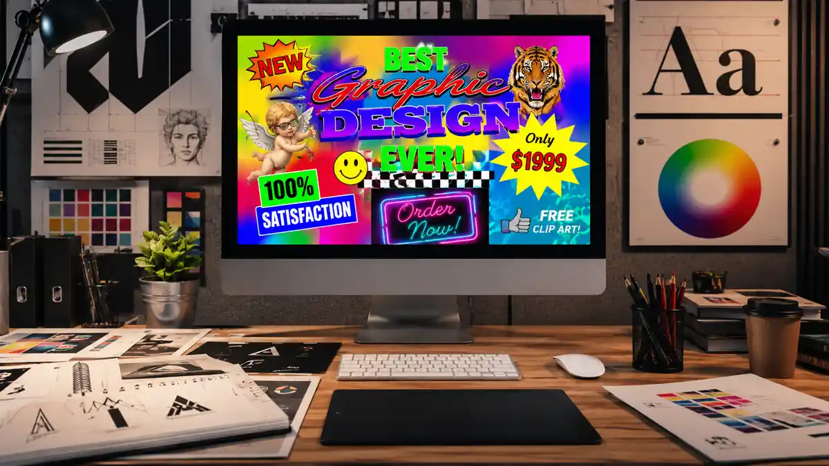
People attach it to intentionally poor designs featuring:
- Too many fonts
- Distracting backgrounds
- Poor color choices
- Low-quality images
- Misaligned elements
- Overuse of effects like shadows and gradients
The joke suggests that someone proudly claims graphic design is their passion while producing work that ignores basic design principles.
Over time, the phrase evolved into shorthand for any creative effort that is enthusiastic but technically flawed.
The Origin of the Meme
The meme traces back to social media platforms around 2014.
A widely shared image featured:
- A green background
- Random decorative elements
- Multiple font styles
- Low-resolution graphics
- The phrase “Graphic Design Is My Passion”
The image quickly spread across platforms like Tumblr, Reddit, and Twitter (now known as X).
Designers immediately recognized the parody because it exaggerated mistakes they frequently encountered in real-world projects.
What made the meme successful was its relatability. Almost every designer had seen—or created—something similar early in their learning journey.
Why the Meme Became So Popular
Several factors contributed to its lasting popularity.
It Was Instantly Recognizable
Even people with no design background could tell the image looked “off.”
The visual chaos became part of the joke.
Designers Related to It
Professional designers often receive client requests that unintentionally create poor designs.
Examples include:
- “Can you make the logo bigger?”
- “Use six different fonts.”
- “Add more colors.”
- “Can everything stand out equally?”
The meme became a humorous response to these situations.
It Reflects Internet Creativity
The internet loves self-aware humor.
Rather than mocking beginners, many creators use the meme to laugh at their own learning experiences.
Common Design Mistakes Featured in the Meme
| Design Element | Good Practice | Meme Version |
|---|---|---|
| Typography | 1–3 complementary fonts | 8+ random fonts |
| Color Scheme | Consistent palette | Clashing colors |
| Alignment | Structured layout | Random placement |
| Images | High-quality visuals | Pixelated graphics |
| White Space | Balanced spacing | Overcrowded composition |
| Hierarchy | Clear focus | Everything competing |
This comparison explains why the meme works so well. It exaggerates genuine design mistakes that professionals try to avoid.
The Real Design Lessons Hidden Behind the Joke
Ironically, the meme can teach valuable design principles.
Typography Matters
Good typography improves readability and professionalism.
When fonts compete with each other, users become distracted.
Simplicity Often Wins
Many successful brands rely on minimal design.
Consider companies like Apple or Nike. Their visual identities are memorable partly because they avoid unnecessary complexity.
Visual Hierarchy Is Essential
Viewers should immediately understand:
- What is most important
- What comes next
- Where to look last
The meme intentionally breaks this rule, making everything fight for attention.
How Professional Designers View the Meme Today
Interestingly, most designers view the meme with affection rather than criticism.
Many professionals remember creating similar designs when they first started learning software like:
The meme has become a reminder that every expert was once a beginner.
In some ways, it celebrates curiosity and experimentation—even when the results aren’t perfect.
Graphic Design Then vs Now
Early Internet Design
Characteristics included:
- Flashy effects
- Bright gradients
- Animated graphics
- Decorative typography
- Busy layouts
Modern Design Trends
Today’s design world favors:
- Minimalism
- Clean typography
- Responsive layouts
- Accessibility
- User-centered design
Yet despite these changes, the meme remains relevant because poor design decisions never completely disappear.
Real-World Examples of “Graphic Design Is My Passion” Moments
Many examples appear online every year:
- Overcrowded event posters
- Confusing restaurant menus
- Social media graphics with excessive text
- Promotional banners using dozens of effects
- Unofficial advertisements with poor readability
Sometimes, even major organizations accidentally create designs that attract “Graphic Design Is My Passion” comments from users.
That’s part of what keeps the meme alive.
Recent Trends: AI Design and the Meme’s Return
The rise of AI image generators has given the meme new life.
Many AI-generated graphics occasionally produce:
- Strange typography
- Awkward layouts
- Unnatural visual hierarchy
- Confusing compositions
As a result, designers often jokingly caption flawed AI creations with “Graphic Design Is My Passion.”
The phrase has evolved from a design joke into a broader commentary on creativity and technology.
What Beginners Can Learn From It
If you’re learning design, don’t fear the meme.
Instead:
- Experiment freely
- Study typography
- Learn color theory
- Practice layout principles
- Seek constructive feedback
- Compare your work over time
Every experienced designer has created work they would redesign today.
Growth is part of the process.
FAQ
It is a humorous internet meme that uses intentionally poor design to parody common mistakes made in graphic design.
The meme gained widespread popularity around 2014 through social media platforms and online design communities.
Not usually. Most people use it humorously and recognize that every designer starts as a beginner.
Because it remains a funny way to highlight design mistakes, client requests, and creative challenges.
Yes. It indirectly teaches concepts such as typography, color theory, visual hierarchy, and layout design.
Conclusion
“Graphic Design Is My Passion” has survived far longer than most internet memes because it captures a universal truth: enthusiasm alone doesn’t create expertise.
What began as a joke about bad design evolved into a cultural symbol recognized across creative industries. Designers continue to share it because it is funny, relatable, and surprisingly educational.
The next time you see a chaotic poster filled with mismatched fonts and clashing colors, you’ll understand why this simple phrase continues to make the internet laugh—and why it remains one of the most enduring design memes ever created.